Creative Collision
07.08.24
![]() share
share
Perhaps the most overlooked factor in skateboarding is that it’s a highly cerebral physical discipline. The process of learning, mastering, and creatively applying tricks allows the individual to tell their story through the entire language of skateboarding. Professional skateboarder, designer, and Converse CONS team rider Alexis Sablone embodies skateboarding’s intersection of art and movement, and her breakthrough contributions continue to shape its culture. With a career spanning decades of contests, videos, and off-the-board visual expression, Alexis has earned icon status not only for her output but the thought, intention, and craft behind it.
As Paris approaches, we spoke to Alexis about her landmark collaboration with Nike SB designing the Federation Kits for the games and the creative process behind the Chameleon Nike Dunk Low SB and signature AS-1 Pro.
Were there any learnings or observations you had during skateboarding’s debut in the games that informed your design concept?
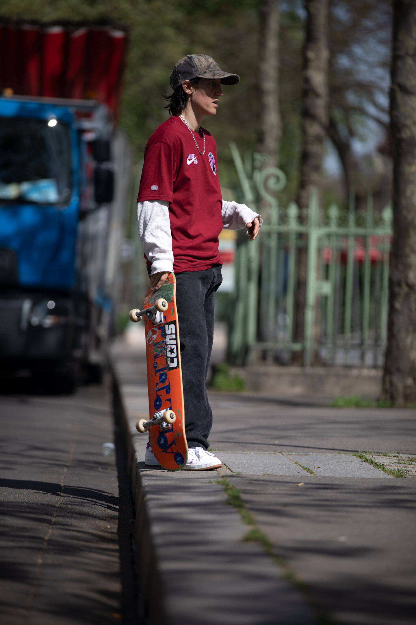
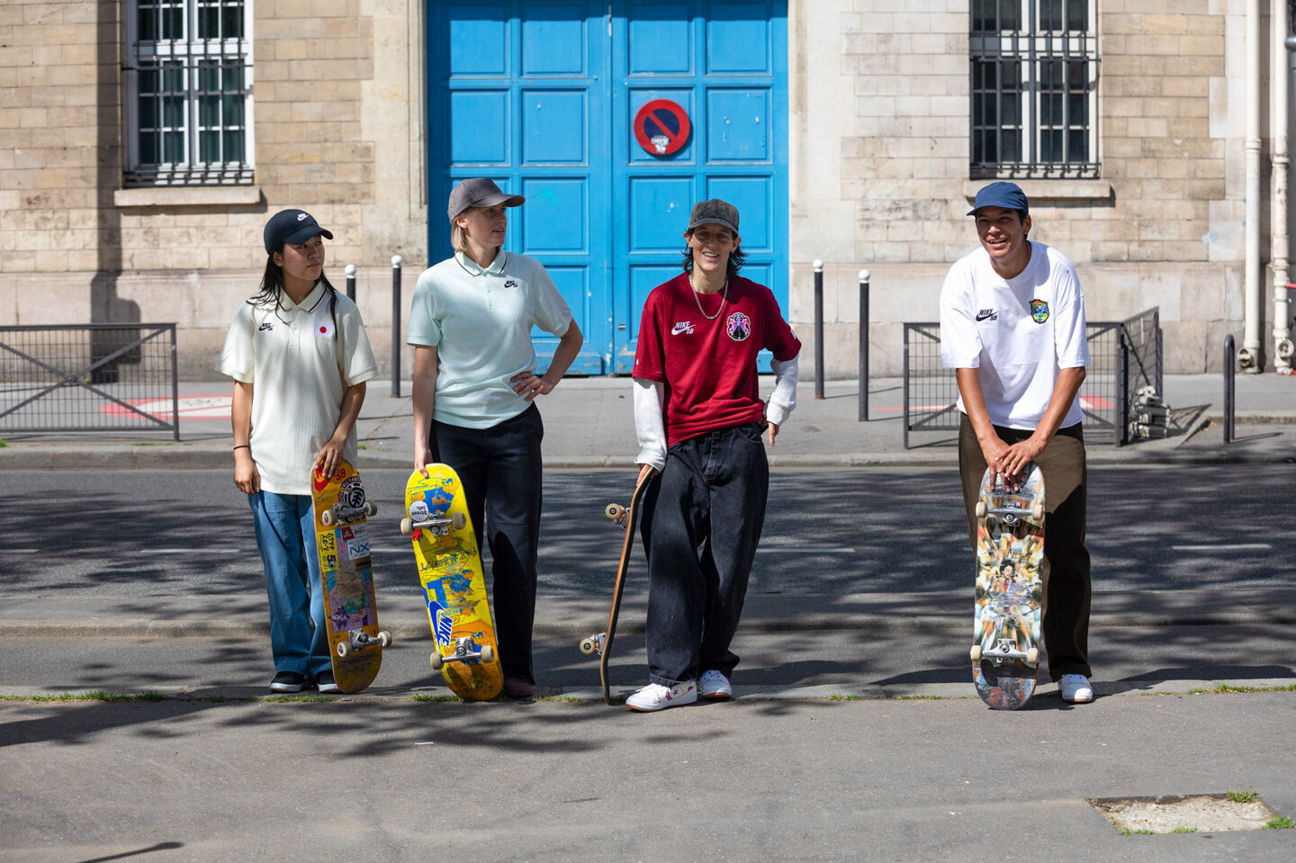
Skaters have always expressed their individual style, at least partly, through the clothing they choose to put on. Unlike in regular “sports”, where a uniform is almost an expectation, in skateboarding, it’s an altogether foreign concept. I wanted to be sensitive to that by trying to create really diverse range of options, so skaters could still try to pick something that felt like them.
How did you begin the ideation process for the project and how did you start to build those concepts before you started to design?
The narratives helped me guide the design. When you begin the design process it feels like every direction might be a possibility. You can feel lost in a sea of options and it becomes impossible to move. Grounding the concept in narratives about skateboarding—about the way it has evolved and been shaped by two different cultures and atmospheres—helped me find a direction that felt authentic and helped me eliminate possibilities. From there it became a challenge of researching and representing those two distinct narratives with a limited number of symbolic elements and then trying to tweak those elements to have more life and personality.
Can you talk about how you landed on each visual narrative for the kits?
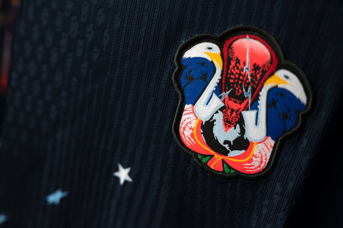
The crests marry several elements: flowers, animals, and geologic events. I wanted to maintain some level of consistency across federations by incorporating the same types of elements and using different particularities to tell different stories.
The United States story is an origin story—the fact that skateboarding was born there and exploded into a global culture is something special and something that I think can lead to a feeling of national pride. The huge explosion in the U.S. crest illustrates that, flanked by bald eagles playing saxophones. A bald eagle is a very serious character, just as the Olympics are a very serious event. I wanted to sprinkle in something more playful to tie back to the rule-less improvisational nature of skateboarding and those first kids in parking lots breaking their roller skates and nailing them to planks of wood just to do something new.
For the Japan crest, I wanted to tell a story about boundless creativity bubbling under the surface and flourishing into something remarkable. I’m not Japanese, so this is, of course, just the story of someone from the outside looking in with the utmost respect and admiration.
In contests, I’ve been absolutely destroyed by Japanese skaters one-third my age and it’s been incredible to watch those skaters progress and take women’s skating to new places. As a street skater, some of the videos in the last decade I go back to time and again are from crews of Japanese skaters taking over Tokyo by night, in the most mind-melting and creative ways. The Koi fish and mountain bubbling with morphed flowers was my best attempt at representing all of this. A fish that swims against the current, breaks from the status quo and goes against the grain—an eruption of beautiful creativity. It’s quite a sensitive thing to design something for a country and culture that isn’t your own—I tried my best to do it justice.
How do you approach designing footwear as both a functional piece but also a storytelling device?
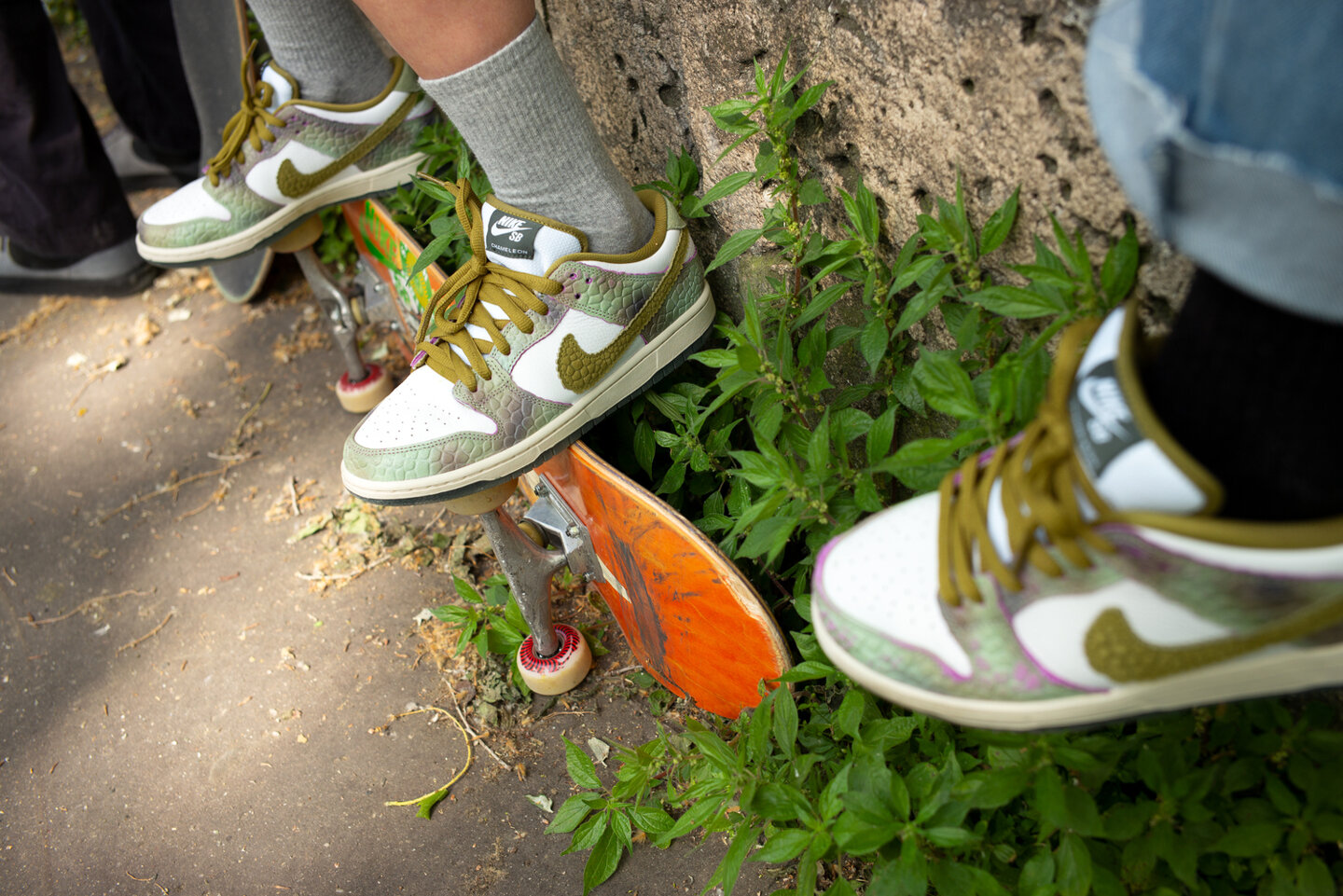
I try to find a balance between something distinct and memorable, but classic and simple at the same time. As skaters, we’ve all had those shoes or jeans or hats we wore in footage at one point or another, that we just can’t bear to look at a few years down the line [laughs]. That said, each project is different and a new opportunity. With the Dunk, so many things have been done over the years and I wanted to try something that felt different and was a little louder than I’d normally do. I think that comes through. After all, it’s a bumpy, multi-colored, and color-changing shoe—not super subtle. When you hold it, you can’t miss those elements. At the same time, the background panels are white and from far away, the bumps become harder to see. So I think that brings back a certain element of “classic”. It just depends on where you’re standing.
Being a multi-disciplined artist and designer, does your work with sculpture/architecture help with shoe design?
From a technical standpoint, it comes in handy—just being able to model and visualize aspects of a shoe. For example, with the Chameleon Dunk, I wanted to make the bumps as bumpy as possible, but before physically prototyping something like that, it’s hard to say where the line between too much and just enough is. I used some basic parametric tools to model the bumps so that I could adjust them in 3D space with a digital slider and try to envision the shoe better. Maybe not necessary, but I love stuff like that and that’s an exciting part of the process for me.
Can you discuss how you thought about each shoe individually as well as their story together?
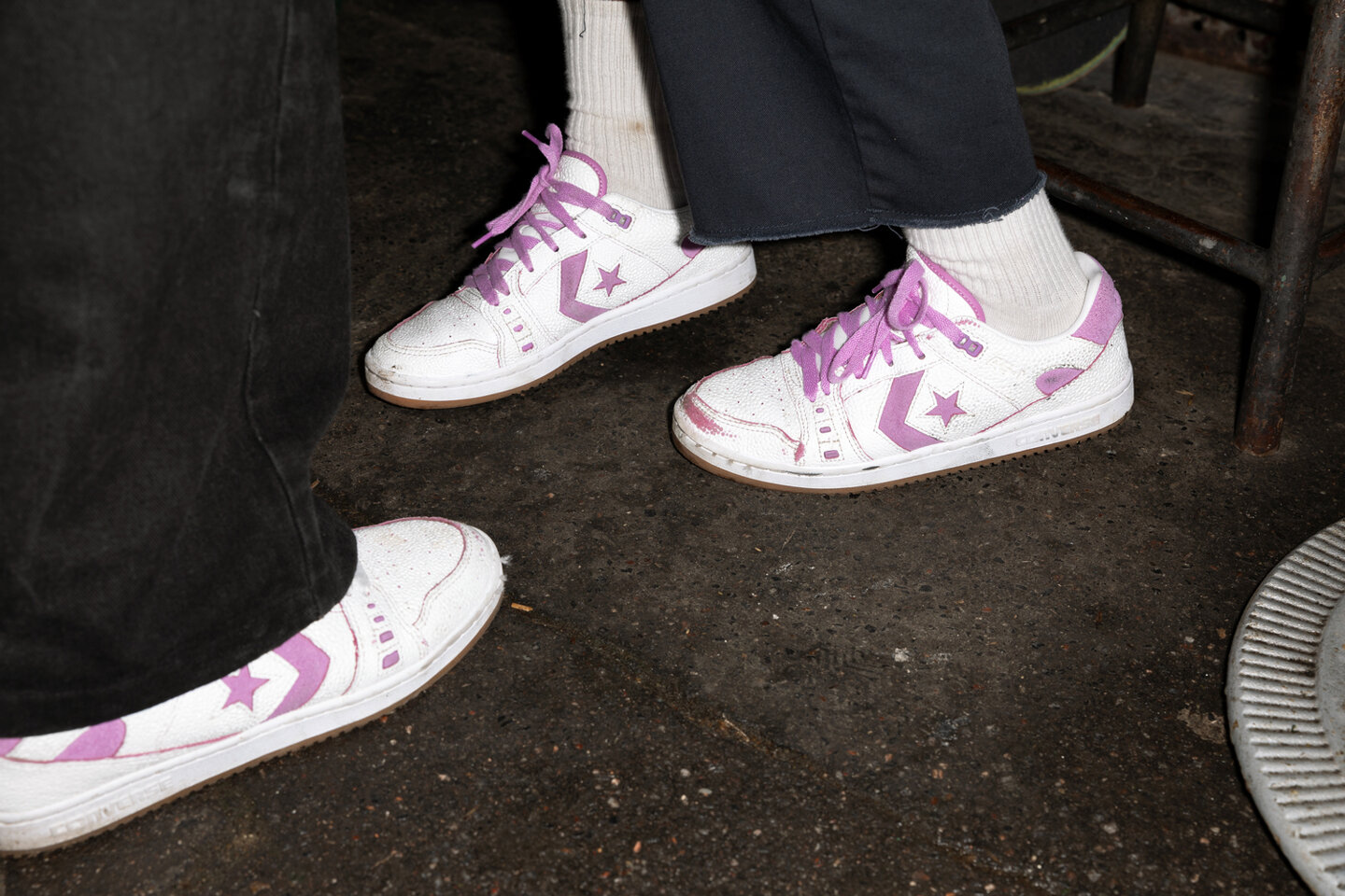
Deep down, I like simplicity. I wanted to keep the AS-1 Pro a bit simpler to balance out the louder Dunks. To me this made sense because the AS-1 Pro is obviously a much younger shoe—it hasn’t been done a million different ways yet, so for it, a small-scale bumpy surface is still uncharted territory. I also like the way the two shoes look almost unrelated at first glance, and only upon further inspection can you start to pick up on similarities and overlapping details—the bumps, the sockliner, the tongue tag, and probably my favorite: the wear away to pink/purple. Technically, if you wore both shoes to death and had some weird, crazy flick pattern, or basically just took a piece of sandpaper to them both, they’d both become fully pink suede shoes. I think that’s fun.
How did you want to specialize the AS-1 Pro to tell a larger story than its original identity as your signature model?
It’s rare for Nike and Converse to come together for a double-box project like this. The AS-1 is a shoe I love and a project I worked really hard on. It’s still crazy for me to see it out in the wild and it still feels incredibly rewarding whenever someone comes up to me and says they enjoy skating it—it really means so much. I hope it’s a shoe that will be around for many years to come, so it feels really special to be able to put it into a box with a Dunk which, of course, needs no introduction and already has years of history behind it.
With this being your first time designing the Dunk and knowing how many different iterations the SB version has had, how did you combine the design story with each component of the shoe to make it fresh and unique?
Over the last 20+ years, there have been so many different spins put on the Dunk—it’s an exciting but also challenging thing to approach as a designer. I felt like tying the Dunks into the chameleon concept of the uniforms provided a strong starting point. I saw this one image of a chameleon that I loved—it wasn’t super saturated and bright rainbow colors—it was more earth tones with one small portion of pink and purple on its face. I kept going back to it and that helped guide a lot of my choices. Earth tones that wear away into something bright and vivid.
With the bumps, I felt like we should just push them as far as possible—even affecting the edges of the panels, giving them a slight bump as well. Why not? Some people will love it and others will hate it—it’s the risk you run but you can never please everyone so why try? I think my favorite part is how the pink color shows on just the very edges of the panels—it hints at what’s underneath.
Unlike many sport-focused shoes, the way a skate shoe wears in is very specific and apparent visually. Can you talk about that dynamic?
When I was trying to think of an animal that is representative of skateboarders, the Chameleon popped into my mind right away. There is no one “physique” or “build” that is key to being a great skater. Skateboarding is about individuality expressed through style—moving in your own distinct way is the most prized thing you can have as a skater. The elastic identity of the skater—this vast, open question mark of possibility—felt well represented by a chameleon. Added to that, as skaters we comb the city looking for interesting spots—reappropriating architecture designed for other uses. Once we find spots we like, the process of trying tricks for hours, adapting our bodies to the forms and rhythms of the city ensues. Nothing more chameleon than that [laughs].
When we see and react to a finished design, it’s easy to forget what went into creating it. Was there anything you struggled with design-wise or had to solve for—or a breakthrough moment—that led to these shoes being what they are?
That’s always how it goes—a finished design looks obvious and simple. The process, on the other hand, is always so challenging… very much like skateboarding in some ways. You see somebody land a trick and it’s so casual—how could you know they slammed on the ground for five hours straight in the process? Maybe that’s just me—both with skating and design. I always go through a ton of iterations when I’m designing, searching for something that feels just right. Ultimately, perfection doesn’t exist, there’s a deadline, and you just go with your gut and try not to look back.
Looking back to Toyko, have you noticed changes in skateboarding and what are your expectations for Paris?
Skateboarding has been changing for as long as I’ve been doing it. It’s hard to say what causes the change—a shift in fashion, a rogue individual, a crew, a pandemic, the economy, an app, a contest. Who knows?! We should probably start worrying when it stops changing at all.
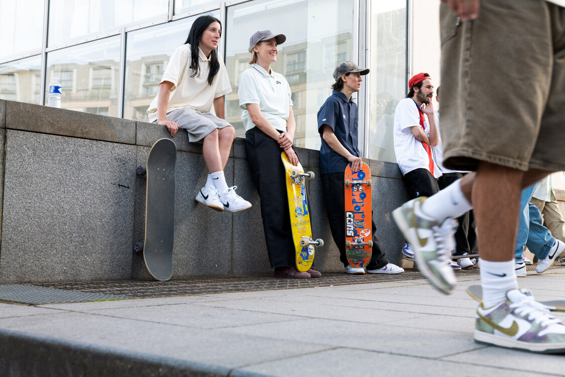
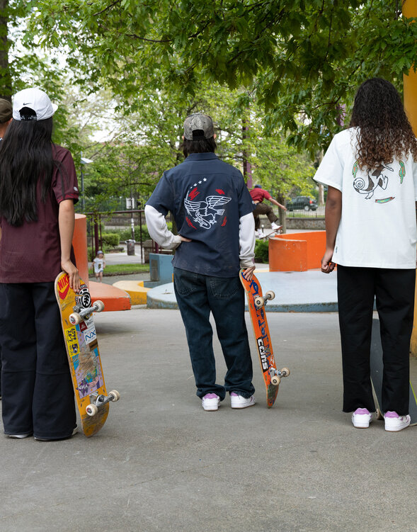
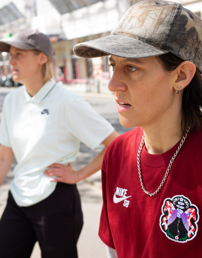
All photos by Marcel Veldman
The SB Dunk Low and Converse AS-1 Pro by Alexis Sablone release in select Skateshops and SNKRS August 29.
07
10
24
The Fluff: Paris
Take a look through Marcel Veldman's viewfinder as the SB team takes to Paris in the 2024 SB Federation Kits.
07
09
24
Behind the Design: SB Federation Crests
Dive into the inspiration and creative process that went into the making of the 2024 Skateboarding Federation Kit Crests with Alexis Sablone.

![]() Load More
Load More